
OSCSS.003 teaches CSS measurement units through an actual responsive-browser experiment. px, em, rem, percentages, and viewport units calculate sizes from different reference points. Choosing the right reference helps pages adapt to small screens and reader font preferences. The lab demonstrates those differences without making production performance claims.
Prerequisites include OSCSS.001: Selectors and OSCSS.002: Cascade and Specificity. The elements in OSHTML.006: Semantic HTML and controls in OSHTML.004: Accessible Forms also need usable sizing. The MDN units guide supplies the definitions.
Learning objectives
- Explain CSS pixels versus physical display pixels.
- Calculate
emandremfrom font-size references. - Use percentages,
vw, andvhwith appropriate constraints. - Combine
min()andclamp()for adaptive sizes. - Check responsive behavior at desktop and mobile widths.
Web Dev Simplified, “Learn CSS Units in 8 Minutes” (2019). Explains pixels, percentages, viewport units, em, and rem. Player playback requires separate verification.
Pixels and percentages
A CSS pixel is a reference unit, not necessarily one device pixel. High-density screens may use multiple hardware pixels for one CSS pixel. A fixed width: 600px could exceed a narrow screen, so constraints such as max-width: 100% matter. For a usual block box, width: 60% uses the containing block’s width; a percentage font size instead refers to the parent font size. The percentage reference explains the property-dependent behavior.
Root-relative and element-relative font sizes
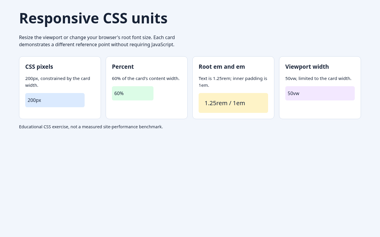
rem uses the root element’s computed font size. With a 16px root, 1.25rem equals 20 CSS pixels. When em is used for font-size, its reference is the inherited font size; for padding, it uses the element’s own font size. Thus padding: 1em on a 20px element yields 20px of padding. Nested em-based font sizing can compound, while rem sizing avoids repeated multiplication.
Viewport units and responsive typography
1vw is one percent of viewport width, and 1vh one percent of viewport height. Dynamic browser toolbars make viewport height especially complex on phones, where svh, lvh, and dvh provide additional choices. The MDN length reference documents those distinctions.
Kevin Powell, “CSS em and rem explained” (2017). Demonstrates how em calculations change between font size and other properties.
clamp(min, preferred, max) bounds a flexible value. The lab’s clamp(1.75rem, 1rem + 3vw, 3rem) computes to 28px at 390px viewport width and 48px at 1,280px when the root font is 16px. Those outcomes change when the root font changes. Relative minimum and maximum limits also support readable zoom behavior, which still needs manual accessibility review. See MDN clamp().
The reproducible browser lab
Save the full HTML example and open it in a current browser. The following excerpt shows the CSS rules under test. A responsive grid uses a minimum card size, while min(100%, 16rem) prevents its tracks from exceeding a narrow container:
The complete browser-tested HTML exercise and 20-check Chromium test script are archived in GitHub for independent reproduction.
/* OSCSS.003: core styles from tested Chromium lab */
* { box-sizing: border-box; }
:root { font-family: system-ui, sans-serif; }
main { width: min(92%, 72rem); margin: 2rem auto; }
h1 {
  font-size: clamp(1.75rem, 1rem + 3vw, 3rem);
  line-height: 1.2;
}
.cards {
  display: grid;
  grid-template-columns: repeat(auto-fit, minmax(min(100%, 16rem), 1fr));
  gap: 1rem;
}
.card { padding: 1.25rem; min-width: 0; }
.sample-px { width: 200px; max-width: 100%; }
.sample-percent { width: 60%; }
.sample-rem { font-size: 1.25rem; padding: 1em; }
.sample-vw { width: min(50vw, 100%); }
<main>
<h1>Responsive CSS units</h1>
<section class="cards" aria-label="CSS unit demonstrations">
<article class="card">
<h2>Root em and em</h2>
<div class="sample-rem">1.25rem / 1em</div>
</article>
</section>
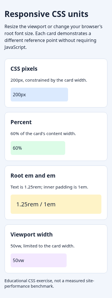
</main>Chromium tests at 390px and 1,280px passed 20 checks, covering computed percentage widths, rem text, em padding, viewport-constrained widths, clamp boundaries, and lack of document overflow. Increasing the root font from 16px to 20px raised 1.25rem from 20px to 25px. These tests validate one browser environment, not every browser or assistive technology.
Common errors and knowledge check
- Do not equate a CSS pixel with one physical screen pixel.
- Do not assume every percentage refers to viewport width.
- Avoid unconstrained fixed widths and
100vwvalues that may overflow. - Do not force all text to fixed sizes without testing zoom.
- Check changing mobile browser controls before choosing
100vh.
With a 16px root, 2rem computes to 32px. If a containing block is 400px wide, width: 60% normally yields 240px. Use clamp() when a preferred size must stay between two boundaries.
Sources and conclusion
CSS sizing becomes predictable when every value has a known reference. Choose rem for root-based sizing, em for spacing linked to element text, percentages for container proportions, and viewport units when screen dimensions matter. Constrain fluid values and test in browsers at more than one screen width.
Editor’s Note: OSCSS.003 follows verified OSCSS.002 in the OpenCert curriculum. The featured 1200 × 630 image is original AI-generated photorealistic editorial artwork, with the approved BitcoinVersus.tech wordmark applied once. Two in-story screenshots were captured from a real Chromium test at 390px and 1,280px; 20 automated checks passed. Both educational video sources are identifiable, but third-party playback remains unverified. No quantitative SmartChart was created because the example contains instructional CSS values rather than comparable external measurements.

To scan on mobile, display the QR on another screen or use a trusted wallet’s saved-image scanning feature. Confirm the recipient and amount in your wallet before authorizing payment.
We volunteer daily to ensure the information on BitcoinVersus.Tech is Verifiably True. Optional contributions help support continuing technical research.
Examples are educational and do not replace cross-browser, mobile-device, zoom, screen-reader, or production accessibility tests.


Leave a Reply