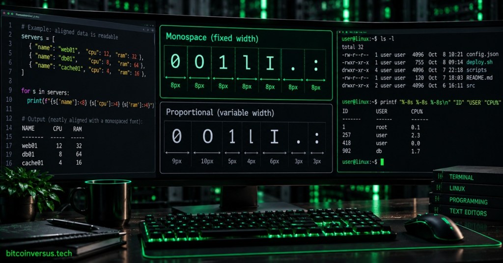
A monospace font is a typeface in which every character occupies the same amount of horizontal space. A narrow i, a wide W, the number 0, and a punctuation mark such as : all advance the cursor by the same width.
That sounds like a tiny design choice, but it explains why monospace text is everywhere in programming. It helps columns line up, makes indentation visually predictable, keeps terminal output readable, and makes individual characters easier to compare. It is the typography sitting underneath tools such as Vim, nano, and many code editors.
Monospace vs. Proportional Fonts
Most text you read in books, websites, and phone interfaces uses a proportional font. Characters receive different widths based on their shapes. A lowercase i is narrow; an uppercase W is wide. That usually makes paragraphs more compact and natural to read.
Monospace fonts deliberately give up that variable spacing. Every character fits into the same invisible cell, almost like text being placed onto graph paper.
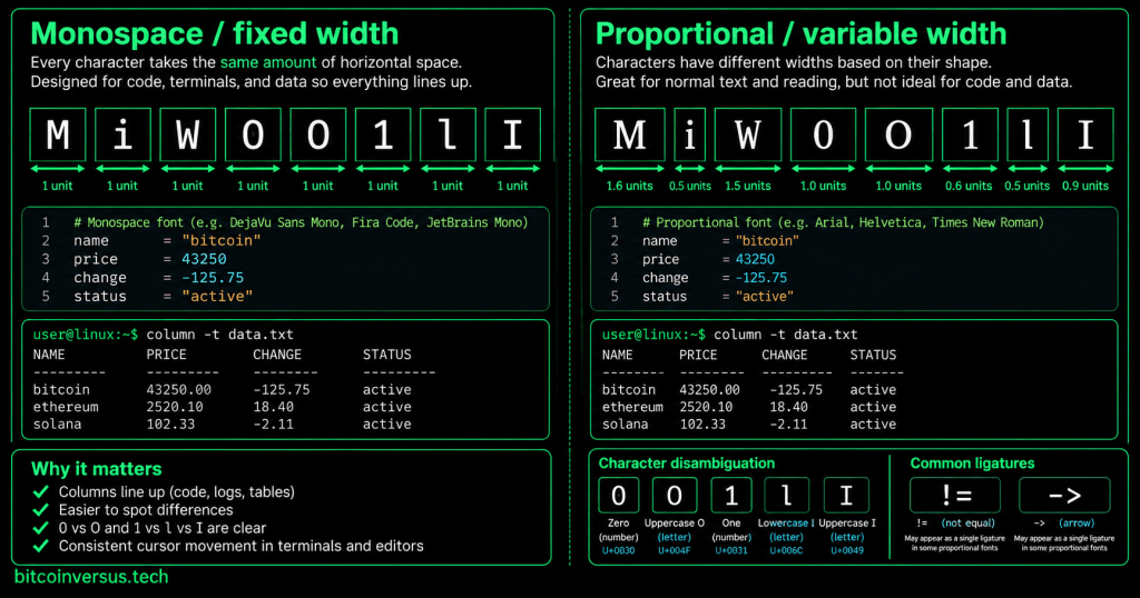
MONOSPACE
NAME      CPU    RAM
web01      12     32
db01        8     64
cache01     4     16
The equal-width grid is why text tables like this can work without visible borders. Spaces become reliable measuring units.
Why Early Computers Loved Fixed-Width Text
Early teleprinters, typewriters, terminals, and text-mode computer displays naturally encouraged fixed character cells. A screen could be described as a grid—80 columns by 24 rows, for example—and software only needed to know which character belonged in each cell.
Modern graphical interfaces are no longer limited to a rigid grid, but terminals preserve the model because it is extremely useful. Shell prompts, permissions, process lists, logs, network output, and command results often depend on predictable columns. That remains relevant when using SSH to administer a remote Linux machine.
Code Benefits From Alignment
Source code is structural text. Indentation, braces, operators, comments, strings, and repeated patterns carry meaning. Monospace fonts make one character position equal to one visual column, which helps programmers compare lines quickly.
if user_active:
    load_profile()
    show_dashboard()
else:
    show_login()
The font does not make the indentation meaningful—the programming language or style rules do that—but the fixed-width grid makes the structure easier to see. Combined with syntax highlighting, a code editor gets two independent visual systems: color identifies token categories while spacing preserves geometry.
Good Coding Fonts Make Similar Characters Look Different
For programmers, equal width is only part of the job. A useful coding font also tries to make easily confused characters visibly different:
0  O
1  l  I
'  `  "
:  ;
{  [  (
A dotted or slashed zero, a distinctive lowercase l, and clear punctuation can reduce visual ambiguity when reading dense code, configuration files, hashes, serial numbers, or command output.
What Are Programming Ligatures?
Some modern monospace fonts can visually combine sequences such as ->, !=, <=, or === into more polished symbols called ligatures. The underlying characters do not change; only their appearance changes.
Typed characters:  !=   ->   <=   ===
Rendered glyphs:   may appear as joined symbols
The open-source Fira Code project is a well-known example: it remains monospaced while offering optional ligatures for common programming character sequences.
Monospace Does Not Mean Every Font Looks the Same
Courier, Consolas, Menlo, DejaVu Sans Mono, Source Code Pro, JetBrains Mono, Fira Code, Cascadia Code, and Monaspace can all satisfy the fixed-width idea while looking very different. Designers still choose stroke thickness, character shape, x-height, punctuation, italics, weights, and how symbols such as zero and one are drawn.
Where You See Monospace Every Day
- Terminal emulators — shell prompts and command output.
- Code editors and IDEs — source code and debugging views.
- Log viewers — timestamps, IDs, addresses, and status columns.
- Configuration files — structured text, scripts, and system settings.
- Diff tools — comparing the same columns across versions.
- ASCII art and text diagrams — shapes depend on equal character width.
- Tables and machine output — columns remain visually aligned.
Monospace Is Usually a Poor Default for Long Articles
The same spacing that helps code can make long prose feel wider and less compact. That is why a website may use a proportional font for paragraphs but switch to monospace inside code samples, terminal output, file paths, or keyboard commands.
On the web, CSS provides the generic monospace font family so a browser can choose an appropriate installed fixed-width face. The MDN font-family reference documents monospace alongside other generic font families.
A Tiny Experiment
Open a text editor and type:
iiiiiiiiii
WWWWWWWWWW
0000000000
1111111111
In a true monospace font, every line occupies the same width because each line contains ten characters. Switch to a proportional font and the i line becomes much shorter than the W line. That one experiment explains the entire fixed-width concept.
The Bottom Line
A monospace font gives every character the same horizontal advance. That makes text behave like a grid, which is exactly what terminals, source code, logs, tables, configuration files, and many debugging tools need. The font is not merely a retro computer look—it is still a practical interface technology.
A light next rabbit hole from here could be what is a file extension? That moves from how code looks to the little suffixes—.txt, .jpg, .py, .json, .exe—people see every day.
Editor’s Note
“Monospace,” “monospaced,” and “fixed-width” are commonly used for the same broad category, although individual typefaces can include advanced glyph shaping, ligatures, or stylistic variants while preserving fixed character advances.
We volunteer daily to ensure the credibility of the information on this platform is Verifiably True. If you would like to support our research initiatives, please donate here: 3C9o19EH5HSiwEPyCTmEKzxhNCbo2X6TTb
BitcoinVersus.tech is not a financial advisor. This media platform reports on financial and technology subjects purely for informational purposes.


Leave a comment